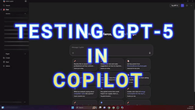
Microsoft has just enabled the GPT‑5 option inside Copilot, and I couldn’t resist taking it for a spin. The toggle that was previously grayed out is now clickable, which means we can finally compare results side by side and see if there’s a tangible upgrade—especially for image and infographic generation.
Baseline test: Infographic generation (pre‑GPT‑5)
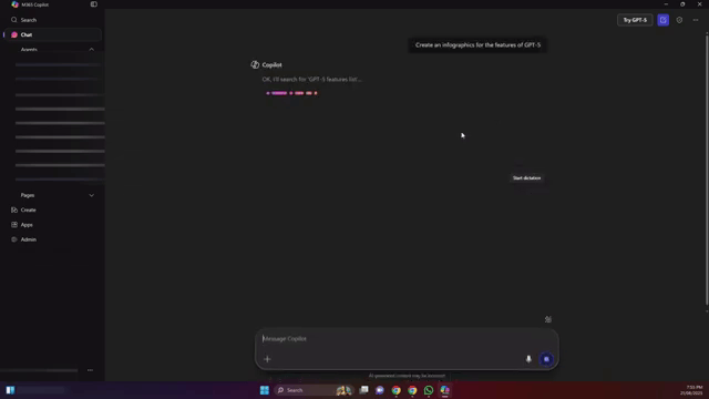
I started with a simple prompt: create an infographic outlining GPT‑5’s features. The goal was to generate a clean baseline result before switching models, then tweak something minor to check editability and consistency.
The initial output looked solid. I scanned it for typos and found none—spelling and text consistency were on point. Next, I asked Copilot to adjust the background color to light blue to see how it handled design edits without changing the content or layout.
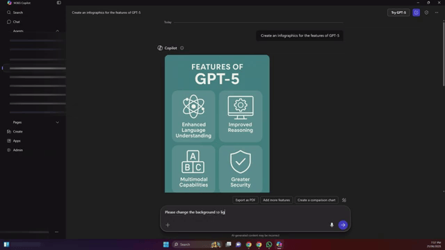
The edit applied cleanly: same layout and content, just a background color shift. So far, so good—quick, precise, and predictable.
Switching to GPT‑5: What changes?
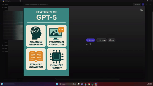
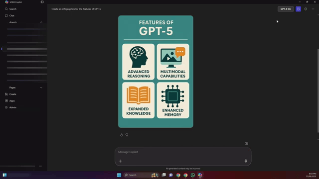
With the baseline saved, I switched the model over to GPT‑5 and ran the same prompt again. At first, I wondered whether the image generation was still tied to the same underlying image model—so I tempered expectations.
Then the new result appeared, and the difference was noticeable. The GPT‑5 version felt more polished and thoughtfully composed:
- Icons: The design included relevant icons that aligned with each feature, improving scannability.
- Visual depth: The layout had more hierarchy and structure, giving it a “finished” look.
- Color usage: The palette was more engaging—easier on the eyes compared to the flatter earlier output.
- Content relevance: The visual elements felt better matched to the topics listed.
Side by side, the earlier version looked flat and a bit generic, while the GPT‑5 output showed a clear step up in design intent and detail. Even if the image backend shares components, the orchestration and choices GPT‑5 makes appear more refined.
Should you enable GPT‑5 in Copilot?
If you have access to the GPT‑5 toggle in Copilot, it’s worth switching it on—especially for visual and structured outputs like infographics. You’re likely to see:
- Cleaner, more relevant visual elements (like purposeful iconography)
- Better color and layout decisions
- Comparable text quality with fewer edits needed
Bottom line: For the same prompt, GPT‑5 produced a more advanced, visually appealing infographic. If the option’s available in your Copilot, turn it on and see how your own prompts improve.

If this article helped you in any way and you want to show your appreciation, I am more than happy to receive donations through PayPal. This will help me maintain and improve this website so I can help more people out there. Thank you for your help.
HELP OTHERS AND SHARE THIS ARTICLE
LEAVE A COMMENT
I am an entrepreneur based in Sydney Australia. I was born in Vietnam, grew up in Italy and currently residing in Australia. I started my first business venture Advertise Me from a random idea and have never looked back since. My passion is in the digital space, affiliate marketing, fitness and I launched several digital products. You will find these on the portfolio page.
I’ve decided to change from a Vegetarian to a Vegan diet and started a website called Veggie Meals.
I started this blog so I could leave a digital footprint of my random thoughts, ideas and life in general.
If any of the articles helped you in any way, please donate. Thank you for your help.
Affiliate Compensated: there are some articles with links to products or services that I may receive a commission.